- by xXDeaRheaXx |
- Painting And Drawing
- | Submitted on 12/12/2009 |
- Skip
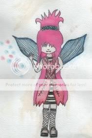
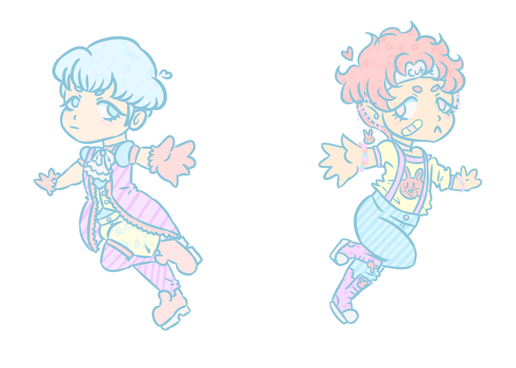
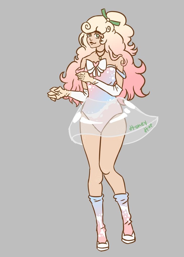
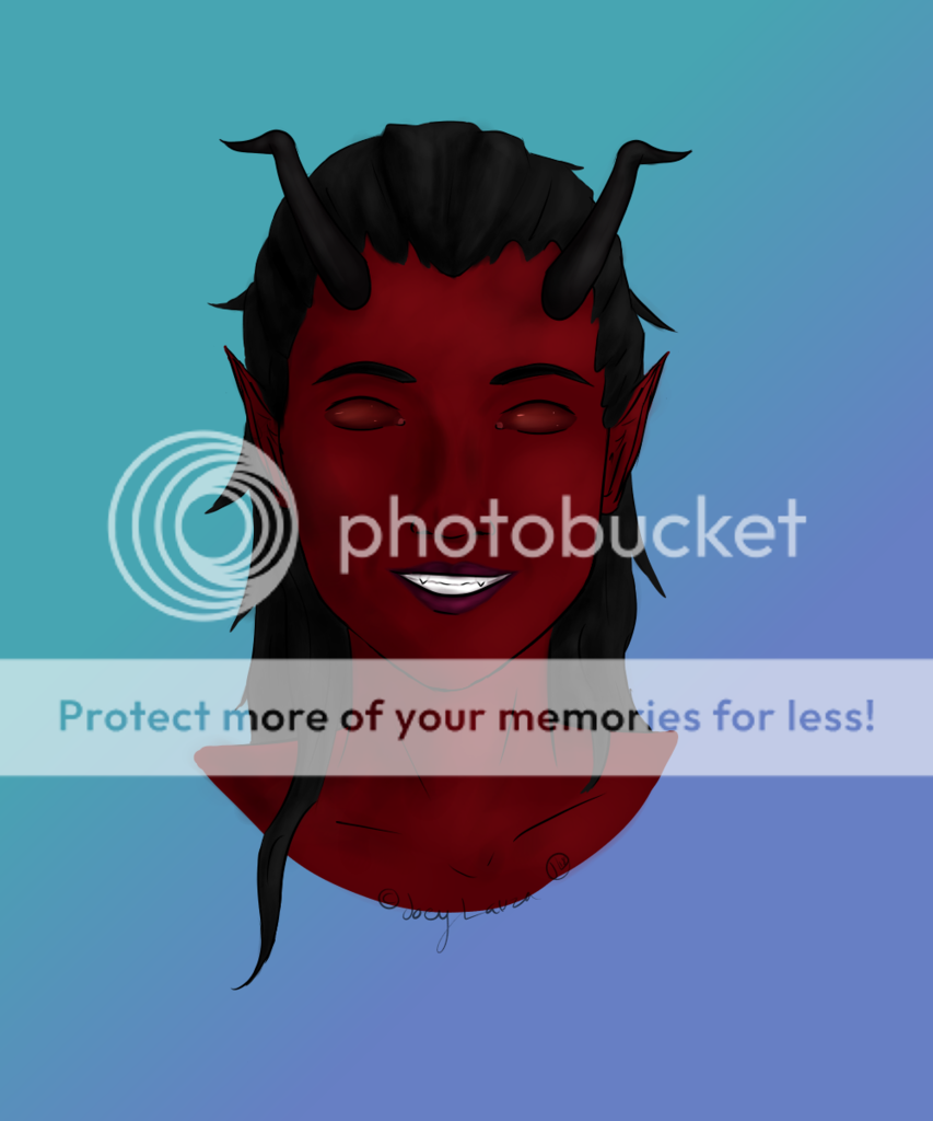
- Title: Light vs. Dark
- Artist: xXDeaRheaXx
- Description: This was something i wanted to make. Enjoy! And please no flames.
- Date: 12/12/2009
- Tags: light dark
- Report Post
Comments (7 Comments)
- sareena456 - 02/22/2010
- I loved that beautiful
- Report As Spam
- Angel1412kaitou - 01/04/2010
-
OMG Hi Hayley! biggrin It's Angela from Latin! You did a beautiful job!
Compliments- Gorgeous coloring, good eye and body shaping, great proportion, and looks relatively symmetrical.
Criticism- ....umm........Oh! You used MS paint didn't you? Use gimp instead, or photofiltre. smile And I think the hair is too straight, but that's my preference.
5/5 - Report As Spam
- xXDeaRheaXx - 12/15/2009
- no lol she was supposed to look confident.
- Report As Spam
- Selene Seraphine - 12/15/2009
-
I agree with the hands comment.. but was the dark side supposed to look.. like.. mad.?
and the light side looks... almost scared... o.o - Report As Spam
- xXDeaRheaXx - 12/13/2009
- Thank you! I never thought of doing that...
- Report As Spam
- Kiss_love_hold_me - 12/12/2009
- This is nice. ^^ My advice is to work on the hands as you can see from prior comments...what you should do is take random pictures off the internet of hands and practice with them..that's what I do and I'm getting better biggrin I hope my advice helps you ^^
- Report As Spam
- xXDeaRheaXx - 12/12/2009
- Thank you! Yes i know the hands need work...i can't draw them well...
- Report As Spam


