- by fallenxangelx13 |
- Painting And Drawing
- | Submitted on 12/21/2008 |
- Skip
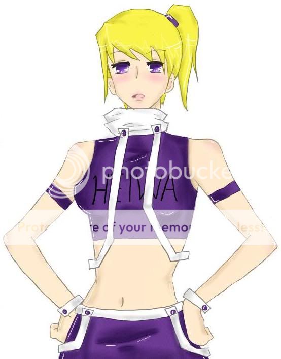
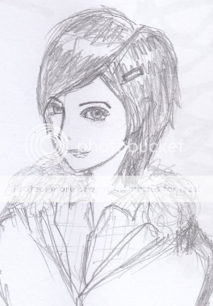
- Title: Care
- Artist: fallenxangelx13
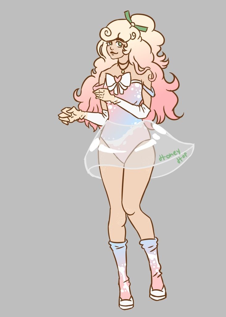
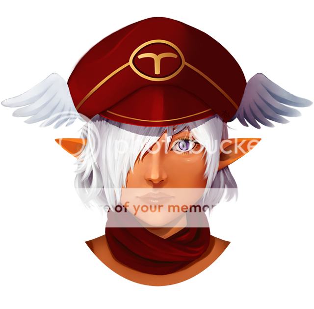
- Description: ya i call it care cuz it looks like she doesn't care about anything or something its one of my earlier drawing (better then my first couple of drawings)
- Date: 12/21/2008
- Tags: care girl anime drawing
- Report Post
Comments (4 Comments)
- Mhion - 01/29/2009
- If you put it's face on the lower left,it would be better.
- Report As Spam
- Adelxe - 12/23/2008
- Hair has no volume making the head look flat and the eyes are too big 3/5
- Report As Spam
- Tyrael_the_vampire - 12/22/2008
- ummm the real problem in it its the hair you need to make it appear with more volume than that to make it look good the space between nose and mouth its too short just keep practicing.
- Report As Spam
- Xao Ba Ko - 12/22/2008
-
eyes are kinda too big and the head is small plus i see boobs..
if it is a girl sorry.. - Report As Spam


