- by tequila_hikari |
- Painting And Drawing
- | Submitted on 06/19/2009 |
- Skip
- Title: Ishtar and Ikuto
- Artist: tequila_hikari
-
Description:
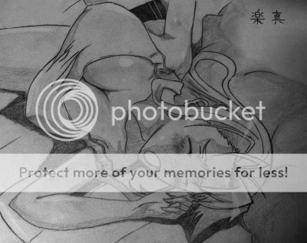
another avatar request with Ikuto from Shugo Chara!
:3
it was fun to draw this, just finished yesterday ^_^
anyway, i did badly on the hands again
maybe Ikuto's other hand is a claw O_O
comments/ critiques appreciated!
no flaming please :3
- Date: 06/19/2009
- Tags: ishtar ikuto shugochara peachpitt anime
- Report Post
Comments (7 Comments)
- Ichigo84 - 03/30/2010
-
Some advice to make Ikuto look more 'manly' XD....
Try to make the neck more bigger or thicker (however you would like to refer it as). Also try to make the shoulders more broad and the eyes smaller. Another tip is to try human proportions, it helps, and try to draw Ikuto's hair "stick" to his face. The side of his hair isn't really poofy so that's what I mean by "stick". *fails to explain this*
Other than that, they are so cute! *glomps the gal with purple hair* - Report As Spam
- Arcius Icarum - 03/12/2010
- Thats a cute drawing. ^^ If your worried about drawing hands. Just practise a little. I'm not very good myself.
- Report As Spam
- Darkangel3070 - 06/24/2009
- try to shorten ikutos hair...i cant love a girl. lol
- Report As Spam
- IkutoY - 06/19/2009
- Well if you can see by my user name I LOVE IKUTO!!!! and i always draw ikuto! well it is really good except ikuto's hair is a little too long.
- Report As Spam
- mikisakura66 - 06/19/2009
-
I like the eyes! Good job on those!!
P.S. Rate and comment back? biggrin - Report As Spam
- Phantom-of_Winter - 06/19/2009
-
to show some clear evidence of light and shadow on their skins and on thier clothing. You should try to practice more on proportions (try using a "skeleton" system). It'll really improve your drawings (believe me, it worked out for me! My artwork improved so much because of it!) And thus, this is the longest critique I have ever written so far. XD
2/5 - Report As Spam
- Phantom-of_Winter - 06/19/2009
- They look very slanted, especially the proportions. The girl's waist looks a little disformed seeing how it becomes too narrow when it gets to the belt and skirt. The girl's arms look way too long and very disproportioned (unless she is some kind of wolf-like creature who's animal-like characteristics are shown). The boy's torso is too long and the arm that is touching the girl's shoulder might be too short. But I liked how you colored this, especially the highlights in the girl's hair. But try
- Report As Spam


