- by Xo_RaNdOm-BiSh_oX |
- Photography
- | Submitted on 01/25/2009 |
- Skip
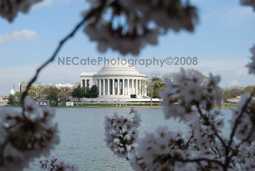
- Title: A plant =)
- Artist: Xo_RaNdOm-BiSh_oX
- Description: I took this without trying to make to make it come out the way it did lol but i think it came out pretty neat....
- Date: 01/25/2009
- Tags: plant
- Report Post
Comments (2 Comments)
- Paper-Flower - 01/26/2009
-
Interesting way of looking at it.
It would probably been really nice if you were able to focus on the stem in in the front
The main focus is on the stem that is pritty much right in the middle, the stems are make the person looking at it have there eyes go off the page.
There are 3 levels to this photo, to get the first level (The blurry stem) is hard to focus on.
But keep up the good work, hopefully the tips will help. - Report As Spam
- Manther - 01/25/2009
- The front stalk is too much in the way. Could have pushed it more to the side. It could have potentially been a good picture.
- Report As Spam


